CREAMY
JAIN MODI.

Mata Janki Real Estate (MJR)
Freelance identity design project done for a client based in Begusarai, Bihar.
CLIENT
SECTOR
Real Estate
Mata Janki Group
MJR is a real estate company rooted in trust and reliability. They wanted their identity to convey from the very first glance. When I started this project, the goal was clear, refresh their brand into something modern and minimal, yet grounded and professional.
I began by studying how MJR positioned itself in a fast-evolving real estate market. Unlike flashy developers, MJR stood for stability, for homes built on strong foundations and long-term relationships. That thought became the anchor for the entire design direction.
CONCEPT AND EXPLORATION
It all began with a simple question, what does stability look like when it’s built for people, not just profit? I wanted the design to feel rooted in architecture yet still carry warmth and a sense of belonging. That balance between structure and connection shaped much of the exploration phase.
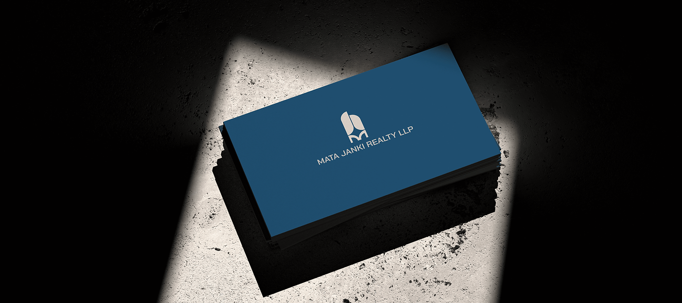
Early sketches explored geometric forms, pillars, and grids, reflecting construction and reliability. Since the client wanted the letter M in the logo, I integrated it naturally into the structure.
The shapes gradually formed an abstract building and foundation, and a subtle sparkle was added to suggest vitality and optimism.
The negative space at the base forms both the letter M and a bridge, symbolizing connection and community. The color palette combines deep blues for trust and stability with natural greens for growth, creating a refined, sophisticated identity that feels grounded and approachable.


DESIGN DEVELOPMENT
Once the core concept was defined, I refined proportions and visual rhythm to make the logo feel strong yet approachable. The challenge was balancing its architectural structure with a sense of warmth and openness.
Alongside the logo, I developed a minimal visual system that could adapt across applications from print stationery to on-site hoardings and digital presence. Typography and grid structures were chosen to complement the logo’s clean geometry, while maintaining a sense of calm sophistication.

Every element, from the logo mark to the color palette and type hierarchy, was designed to reflect MJR’s core idea of refined living built on trust.


The refreshed visual identity gave MJR a distinct and confident presence among competitors. It feels contemporary but grounded, polished yet approachable, much like the kind of spaces they aim to build. Seeing how the brand system came together across different touch points was particularly rewarding; every element carried a sense of calm strength that aligned with MJR’s personality.

What I appreciated most about this project was realizing how design decisions, even subtle ones, can shape how people perceive trust and reliability. It reminded me that a well-crafted identity isn’t just about how a brand looks, but about how it feels , how it reflects the values and ambitions behind it.